
There’s a difference between a home that looks dated and one that looks old.
An old-looking home is like that friend who gets his full eight hours of sleep every night, and works out, and drinks plenty of water, but still looks perpetually tired.

You can actually have a trendy home—new furniture, fresh paint—but STILL give off the interior design equivalent of, “oh man, he could really use a nap.”
How old a home looks is not only about when it was built, by the way. Homes in our area, in and around Keller or Westlake for example, aren’t really that old. Even those built in the ‘80s or ‘90s. Instead, what makes a home look old is a combination of small design decisions that each signal, “this house has been here a while.”
Here are some of the most common culprits!!
1: Lighting a room from one light source (or one light type)
Relying on a single ceiling light to do all the heavy lifting in a room is usually a “left-over” design detail from the original builders. I’ve seen it sooo many times…homeowners invest in beautiful paint colors and wall décor and furniture…then flip on the lights, and it all comes apart!!
Even replacing the central fixture itself won’t help much. That’s expecting one light to do too much. And that’s what layered lighting solves: you create a lighting design for the space that controls the ambience, illuminates tasks, and highlights the room’s best features. Oh, while also making us look eternally Instagrammable!!
Here’s what layered lighting design often looks like:
- Ambient lighting to illuminate the room (with dimmers and controls to set multiple looks, depending on your needs).
- Task lighting where you actually work (under cabinets, beside a reading chair, over a vanity…).
- Accent lighting that draws your eye to artwork, shelving, architectural details, etc.
- Decorative lighting that adds personality, even when it’s turned off!!
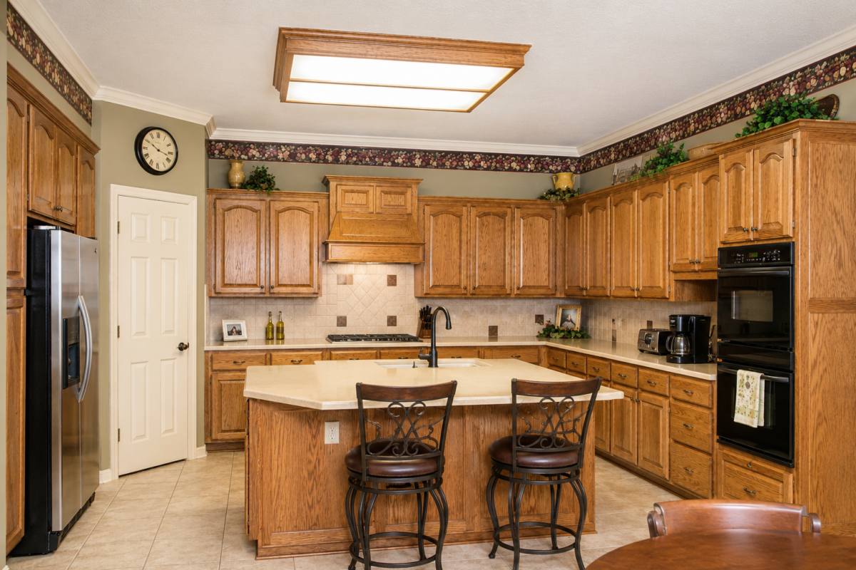
2: Cabinets that stop too short of the ceiling
Let’s talk about that strip of space above the kitchen cabinets. This is the place where decorative baskets go to retire, and where faux greenery slowly collects dust.
For several decades, this was how kitchens were designed. And for the eye in the 1970s or ‘80s, there was nothing wrong with it. But today, that gap is one of the fastest visual cues for me to bring that kitchen into the modern era!!
You want to know why this feature is so important?

Because when cabinetry extends all the way to the ceiling instead, your eye naturally travels upward without interruption. This makes the room immediately feel taller and cleaner.
Ceiling-height cabinetry also solves key “usability” problems by:
- Adding more in-cabinet storage space for seasonal dishes and serving pieces.
- Letting less dust collecting on those impossible-to-reach surfaces.
- Offering a more built-in, high-end appearance.
- Inviting fewer decorative fillers (i.e., clutter).
Now, does every kitchen need ceiling-height cabinets?
No.
If your kitchen has very high ceilings, that might require a different approach. Existing soffits and architectural details deserve special consideration, too. Good remodel design is NEVER one-size-fits-all…which is your reason to start the conversation with me on a free, 15-minute video call. You can schedule right here on the website. ♥
3: Tiny walkways you have to shuffle through
Yes, I’m talking about the clearance between counters and appliances, or bookshelves and furniture, or even the width of your hallway once your side-table is set up!!
Haven’t you been in a kitchen where two people cooking dinner together continually requires one to back up or turn sideways just to get into the refrigerator?!
That’s NOT a “small kitchen” problem.
When kitchens have this problem, it’s a holdover from yesteryear, when only one person (Mom) was in the kitchen. But we live differently today, and the way we set up our homes reflects that in every space. For example, today’s homes handle more chefs, home offices, different styles of entertaining, more appliances, etc.
Therefore, in homes on the “old” side, here are a few places I pay close attention to for clearance:
- Places where people naturally gather.
- The space between the island and surrounding cabinets.
- Clearance around open appliance doors.
- Walkways between furniture.
Believe me, sometimes moving an island just a few inches makes a kitchen feel like an entirely new room!!
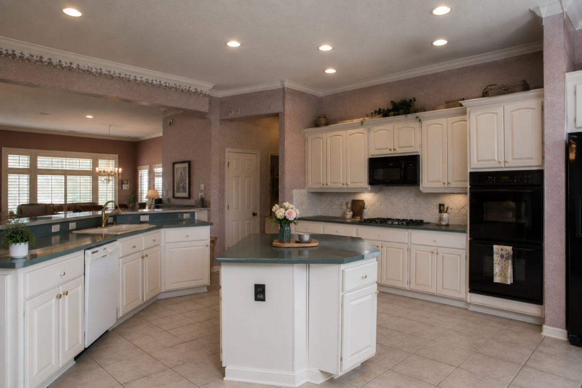
4: Too many finishes competing for attention
If your home has been remodeled bit by bit (by you and/or previous owners), this effect becomes a cacophony of visual noise. Gnarly.
Maybe the kitchen got new countertops five years ago, and someone changed the backsplash in 2019. You updated the cabinet hardware and painted the walls last year, while your flooring might never have been replaced at all!
Those are all perfectly fine and normal decisions. But together, they make your home feel “busy” and old.
When I work with a family on a renovation, I’m constantly reviewing the big picture with questions like:
- How does this full palette come together?
- Are all the metal finishes telling the same story?
- Does this countertop support the cabinets or compete with them?
- How will this space look next to adjacent rooms?
5: Furniture that lives against the wall
If you grew up believing that pushing every piece of furniture against the wall made a room feel larger, you aren’t alone. And if you’re still a believer, I’m here to tell you: often, it does the opposite!!
Besides, big or small, great rooms are designed around conversation and flow…not how much empty space is in the middle.
Pulling certain furniture pieces in just a foot can:
- Make a room feel cozier.
- Improve traffic flow.
- Create better conversation areas.
- Actually make the room appear larger. (More on size and scale here if you want to see how.)
Also, and this is ALWAYS great news: this is a change that’s completely free, and that you can do on your own right now!!
Not sure which pieces should be pulled in? Email me a photo of your space, and I’ll reply!
6: Storage that just “happened” instead of being planned
This one is sneaky. But I’m NOT talking about clutter. I’m talking about the kind of clutter that happens in a modern home that still has storage for set for pre-tablet, pre-home-office, pre-smart-home lifestyles.
This is what we call “reactive storage.” A home without a mudroom, for example, naturally drives us to install hooks where they shouldn’t go. Or maybe in your home, extra shelves happened when there wasn’t a modern walk-in pantry. We adapt because we have to. Right?
After all, solutions are needed in the moment, and they make sense—but they add up. And they tell a story that the home has NOT been adapted to the way people live today.
None of these six things has to do with how old your home actually is. Instead, they reflect how much our lives have changed…and whether your household has invested in “solutions” (i.e., “Band-Aids”) or transformations (i.e., updating the home in a more significant way).
I’ve seen century-old homes feel timeless!! And I’ve seen homes built here in Keller a decade ago that already look “tired.” The difference is in these critical details.
And the best part?! Every one of these design details can be improved!!
About the author:

Robin Burrill, RID, NCIDQ, ASID, IDS, CAPS, is an award-winning professional kitchen, bath, and interior designer. Robin and her husband, Robert Mathews, have owned Signature Home Services, Inc. for over three decades, establishing a superior in-house team with a widespread reputation for delivering meticulous design to their many repeat clients.
In 2022, the national publication, Kitchen and Bath Design News magazine, named Robin to their Top Innovator list in recognition of her achievements in the field of kitchen and bath design. In 2024, she was named one of the Fall 2024 Market Pros and “tastemakers” by ANDMORE at High Point Market. In 2024 and again in 2025, Fixr identified her as one of the Top Professional Interior Designers for their nationwide audience. At the start of 2025, she then acted as one of Dallas Market’s “Style Eyes” at Lightovation and Total Home & Gift Market.
Over her extensive career, Robin has been quoted in Architectural Digest and Forbes multiple times; her design work has been featured in top national trade publications; and she has been interviewed for Designers Today magazine’s “Profiles in Design” video series, among others. Widely respected for the depth of her knowledge, Robin is a sought after speaker and judge for many design industry events.
In 2023, Robin designed a bench for Charleston Forge, making her foray into product design. Robin currently serves as a volunteer on the board of the Dallas/Ft. Worth chapter of the Interior Design Society.
Leave a Reply