There’s something magnetic about a well-done gallery wall.
A thoughtful layout can stop someone mid-stride and invite them closer, eyes scanning from one frame to the next, like following breadcrumbs through a story.

When arranged with intention, a gallery wall can become a journey, or offer a quiet moment of nostalgia that makes someone linger far longer than they expected.
If you’re here, it’s because you’re already a little curious. You look at the photos on your walls and think, “What else could I do with this?”
And you’re in the right place!! What you’re about to get, though, goes WAY beyond a few gallery wall layout ideas. You’ll see the most iconic gallery wall styles contrasted with more artful concepts, those arrangements designed to guide onlookers through color, memories and meaning.
With visual diagrams for every style, plus my personal advice on the emotional effect each layout creates (and even a quiz to help you find the right fit for a wall in your home), your walls are waiting!! Let’s show them off…
Grid Layout
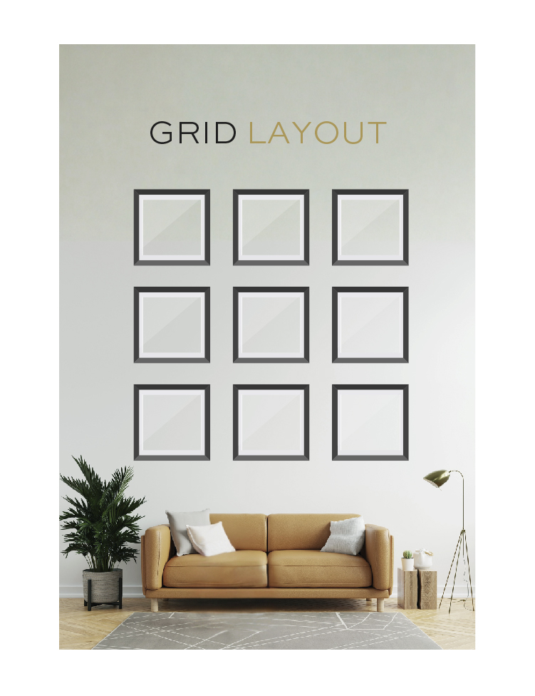
This layout is structured and symmetrical, using identically sized frames arranged in neat rows and columns where the space between each frame is consistent. It’s clean, precise, and highly organized. (Just picture graph paper.)
Grid layouts are great for showcasing a collection of photos that have a common theme…like travel pictures or family portraits. Since the structure is sooo consistent, the visual content should have harmony in tone or subject matter.
This layout works best on wide, open walls like those in a living room, above a sofa, or in a hallway. It’s especially striking when hung over a piece of furniture that echoes its shape, like a long bench or credenza…
Salon Style (aka Eclectic Cluster)
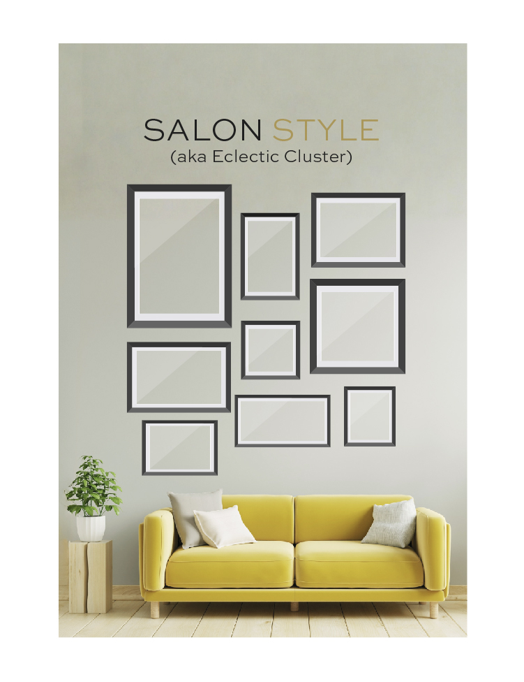
This layout mimics the walls of historic European salons, with frames of different sizes and shapes all arranged together. It’s asymmetrical but still intentional, and goes well with the breathtaking use of organic shapes in today’s biophilic interior design.
Salon style is perfect for eclectic collections. You know…those mixes of photography, artwork, memorabilia, and even dimensional pieces like textiles or small mirrors!!
This layout thrives in large areas where the collection can grow over time, like stairwells, entryways, or high-ceilinged living rooms. It brings a real feeling of storytelling to a space.
Linear Row or Column
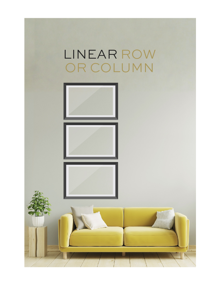
This gallery wall uses a single straight line—horizontal or vertical—of evenly spaced frames. Each frame is typically the same size, too, to create a rhythmic, minimalist visual line.
Linear layouts are best for a focused set of images, like a series of landscapes, portraits, or conceptual work. Anything that reads like a sequence. The simplicity of the structure helps the content take center stage.
Use a horizontal gallery row above a headboard or along a hallway. Use a vertical column gallery on a narrow wall between windows or doorways. This style really is awesome in spaces that benefit from visual direction or elongation…
Centered Anchor
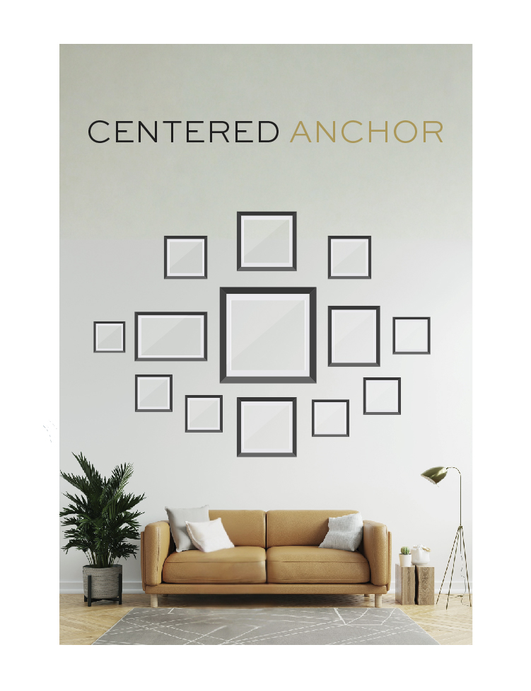
This layout features one large, central image or artwork, with smaller frames around it. The main piece draws attention, while the surrounding items create a halo-like composition.
The anchor works well when you have one standout piece, like a family portrait, a big travel print, or artwork—anything that deserves a spotlight!! The supporting pieces echo its theme or add contrasting elements…
This layout suits focal-point spaces like over a fireplace, in a dining room, or in a study. It naturally pulls the eye to the center and then builds interest outward…
Diptych or Triptych Layout
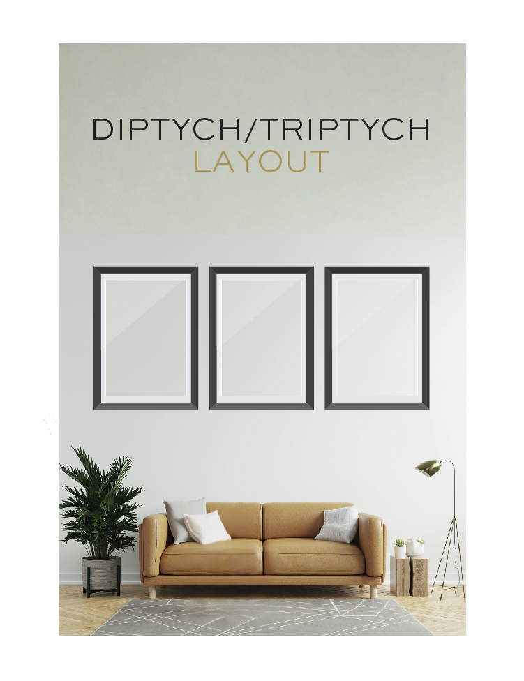
This gallery wall uses two (diptych) or three (triptych) images that are thematically or visually linked and displayed side by side with even spacing.
Diptychs and triptychs are best for a single panoramic photo split across panels. Think trios of complementary prints. This works well when the goal is a cohesive, single-story visual.
These layouts are stunning above beds, sofas, and desks. You know…the spaces where you want balance and symmetry (and definitely NO visual clutter)!! Do note that they require decent wall width and work best where the viewer stands or sits directly in front of them.
Spiral Formation
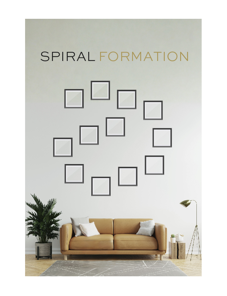
Starting with one central image, this layout builds outward in a spiral pattern, giving the sense of movement and expansion. Fun!! The spacing gradually opens as the spiral grows.
This format is ideal for personal journeys, like childhood to adulthood, or travel adventures, or multi-generational family images. It’s a layout that is SUPER symbolic of growth.
Spiral formations work beautifully on medium-to-large blank walls, especially in living rooms where viewers might explore the wall slowly (and you’ll be there to talk to them about it)!
Constellation Map
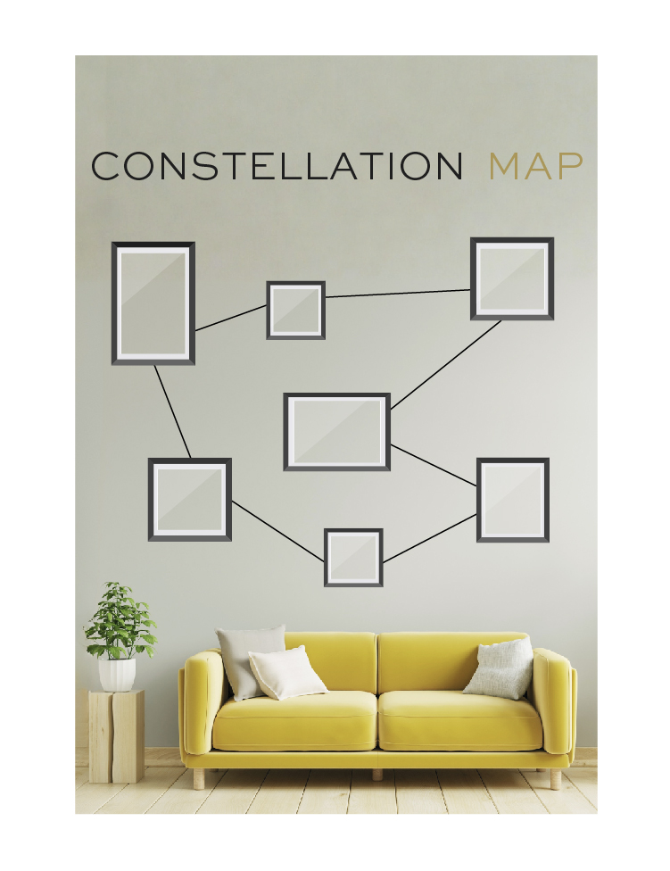
Yes, you can arrange photos like stars in a constellation, seemingly scattered but then connected with ribbons or threads or labels to paint the picture of their relationship.
Use this style when you want to emphasize connection: photos of friends and family, events from a given year, or even thematic collections. This gallery wall style is entirely about storytelling.
This layout looks best in casual or creative spaces like playrooms or teen bedrooms…any space where whimsy and personal expression are welcome!!
Timeline Flow
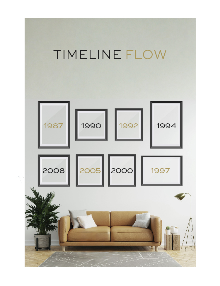
You can easily picture a timeline flow: images are arranged in chronological order, often left to right, but sometimes or top to bottom. This tells a clear story over time.
A timeline flow is pretty much made for family photos, but it can also be used for specific timelines like a baby’s first year, a home renovation series, a long vacation…anything with a beginning, middle, and end (or ongoing end)!
Use this gallery layout in hallways, corridors, or staircases—the places where people naturally move in one direction, letting the timeline unfold as they move through the space.
Color Story Wall
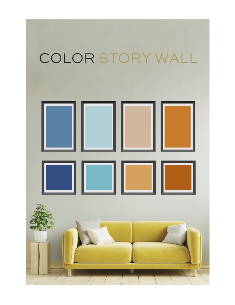
This one arranges images based on dominant color tones in the photos themselves, creating a flow or transition across the wall from one hue to another. It’s tricky to achieve unless you have a specific collection of photos (or artworks) that naturally lend themselves to it, but the visual effect is incredible!!
A color wall is perfect for artistic photography, fashion shoots, or travel photos where color is saturated or plays the star role.
Ideal for creative workspaces where color can energize or amuse, this one REALLY pops when paired with neutral furnishings.
Shadowbox Storyline
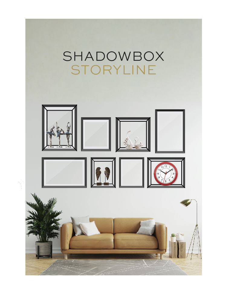
Combining framed photos with shallow shadowboxes allows objects like memorabilia, letters, or souvenirs to appear alongside images.
This is a deeply personal and (literally) dimensional approach to a gallery wall, and it’s best for preserving memories with tactile meaning. Imagine including a wedding invitation with photos from the event, or baby shoes with family portraits, or souvenirs with vacation shots.
Use this one in hallways, personal offices, or near entryways where guests will naturally pause to engage with the display. It’s one of the best conversation-starter walls, that’s for sure!!
Gallery Strip
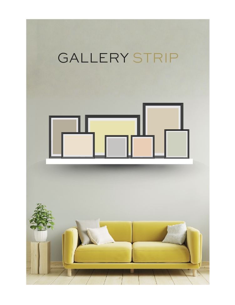
If you install a narrow ledge or rail on a wall, that surface can support overlapping frames set there. This one has the added bonus of being VERY swappable since you don’t need to hang the frames, so you could even go with a seasonal theme and switch photos out several times a year!!
This gallery wall is also perfect for rotating artwork or evolving family portraits.
As for where to put this idea to work, gallery strips work great in small dining areas, kitchens, or even above console tables where a regularly updated strip of photos can always add a new talking point.
Geometric Precision
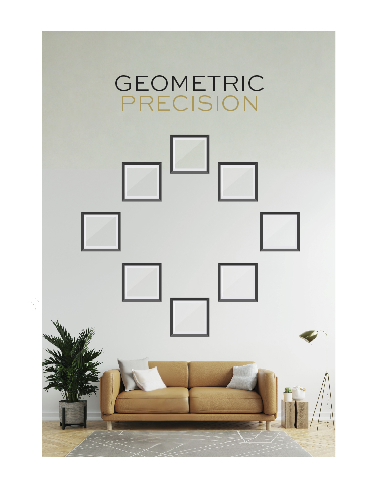
Here, images are arranged in the shape of a geometric figure like a hexagon, diamond, or circle. You choose the shape based on the size of your wall or the images you have to display!!
Best for abstract photos or a set of images with a consistent color palette, the right shape will look SUPER intentional.
Try a geometric gallery wall in a square or round room, OR above a square or round piece of furniture.
Story Arcs
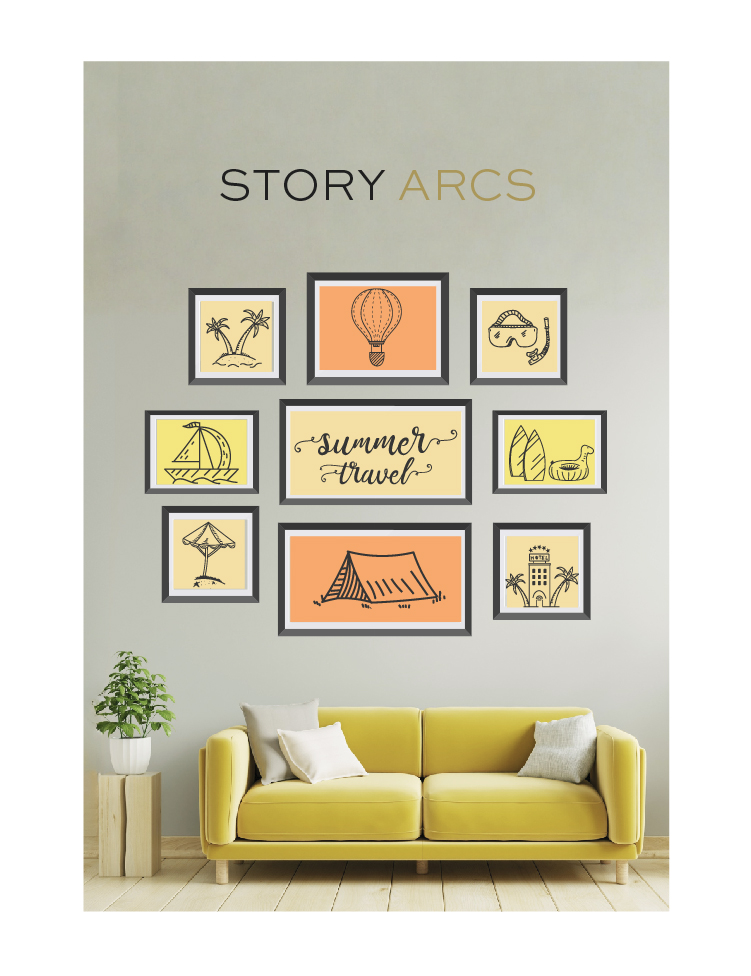
To create a story arch, group photos by different narrative themes—like “Vacations,” “Firsts,” or “Celebrations,” each grouped in a visually distinctive mini-cluster.
This layout is fun AND striking for hobbyists or anyone with collections, or for images of different shared family experiences. The clusters allow stories to emerge in segments…
This is another one that’s best in large spaces, because you can expect the clusters to grow!!
Choosing the Right Layout for Your Wall
With sooo many gallery layouts to choose from, how do you know which one fits your space? OR your specific collectionof photos?!
Start by looking at the wall itself…its size, shape, and location in your home. Then think about whether you want symmetry, movement, storytelling, or drama. Each layout brings a unique experience to the viewer.
As for what you have to hang…is it a series of related photos? A mix of prints and keepsakes? One standout piece with several smaller supporting visuals? You can let your content guide the structure.
Still not sure?! Take our quiz to get answers NOW on a specific gallery wall or list of possibilities…
Setting and Adjusting Your Gallery Wall
ALWAYS start by mapping your chosen layout on the floor or by using paper templates taped to the wall to test placement and spacing.
Then, use picture-hanging hooks appropriate for your wall type (drywall, plaster, or brick), and keep a level, measuring tape, and painter’s tape handy. For symmetrical layouts like the Grid or Triptych, precision matters!!
Later down the line, if you want to change from one gallery style to another, you might need to patch nail holes before reconfiguring the space. Use spackle or filler to smooth over previous hang points, then touch up with paint.
Want to skip the hassle?! I can help you plan, then I can send one of our handymen to hang or rehang the gallery wall of your dreams!! Reach out to me personally…and bring your walls to life without lifting a finger.
About the author:
Robin Burrill, RID, NCIDQ, ASID, IDS, CAPS, is an award-winning professional kitchen, bath, and interior designer. Robin and her husband, Robert Mathews, have owned Signature Home Services, Inc. for over three decades, establishing a superior in-house team with a widespread reputation for delivering meticulous design to their many repeat clients.
In 2022, the national publication, Kitchen and Bath Design News magazine, named Robin to their Top Innovator list in recognition of her achievements in the field of kitchen and bath design. In 2024, she was named one of the Fall 2024 Market Pros and “tastemakers” by ANDMORE at High Point Market. Also in 2024, Fixr identified her as one of the Top Professional Interior Designers for their nationwide audience. At the start of 2025, she then acted as one of Dallas Market’s “Style Eyes” at Lightovation and Total Home & Gift Market.
Over her extensive career, Robin has been quoted in Architectural Digest and Forbes multiple times; her design work has been featured in top national trade publications; and she has been interviewed for Designers Today magazine’s “Profiles in Design” video series, among others. Widely respected for the depth of her knowledge, Robin is a sought after speaker and judge for many design industry events.
In 2023, Robin designed a bench for Charleston Forge, making her foray into product design. Robin currently serves as a volunteer on the board of the Dallas/Ft. Worth chapter of the Interior Design Society.
Leave a Reply